Airbnb +
Redesigning the app to include flight booking
Date: Fall 2021

The Project + Context
During the Fall of 2021, I decided to challenge myself by redesigning the Airbnb mobile app to include flight and car hire. Over 1 week (40 hours), I created and executed the user research and design plan to include competitive analysis, domain research, personas, sketches, wireframes in Figma, a prototype, and medium-fidelity mockups.
Challenge
How could I redesign the current Airbnb app to allow users to book flights and cars in addition to stays and experiences? Currently, Airbnb users have to book flights and cars separately from their Airbnb rentals and activities. Allowing full trip booking (Airbnb +) would allow customers to complete all needed trip reservations in one application.
Concept Validation
“I am not the user.” I reminded myself of this UX principle during my initial brainstorming and design development. I think it’s a good idea to book flights and stays in one app, but is that just my preference? I was certain I couldn’t be alone in this thought; however, I decided to perform a bit of concept validation to help me fail early if I was on the wrong path. Using a platform called Attest, I created a short survey:
-
100 U.S. participants ages 18-66
-
34 States
-
51 (female) 49 (male)
“Would you like to book Airbnb stays and flights within the same app?”
20.6% Eh, sure.
64.9% Yes, that would be awesome.
17.5% No.

In hindsight, it would have perhaps been more useful to find a company’s average user age to provide more context to the data; however, I was comfortable continuing with a majority affirmative response.
Domain Research
My airline industry knowledge was limited; other than the trips I had taken previously, I knew almost nothing from an operations perspective. I had lots of questions and decided to dive into some of the top questions about the business. What are an airline's required fees? Why is it so expensive to change after booking? How long does it take an average user to book lodging, flight, and a rental car separately? Why are hubs cheaper? Why do the prices change so rapidly? How do airlines make most of their money? What are the biggest customer pain points currently?


Competitor Analysis
Next, I decided to scope out the competition. Who in the industry already offers this type of service (flight booking + rental car + hotel)? What do their users love and hate about their platforms? What are their ratings? I used an affinity diagram to group the main user issues based on reviews in the app store and online articles. I discovered a few themes among the critical and positive reviews. Here I focus on the critical, the top issues being frustration from not being able to speak to a human customer service rep, refund delays, and technical issues on the app.
Personas
I also created some personas in Figma as a part of my user research plan. Below are three; others could include retired couples booking trips, young adults, adults booking guys and girls trips, families booking vacations, as well as singles that love traveling so much they essentially make a lifestyle.


Sketches
After conducting my research, I ideated and started with paper sketches. The sketches below are a few of the first designs of the car hire and flight booking screens.


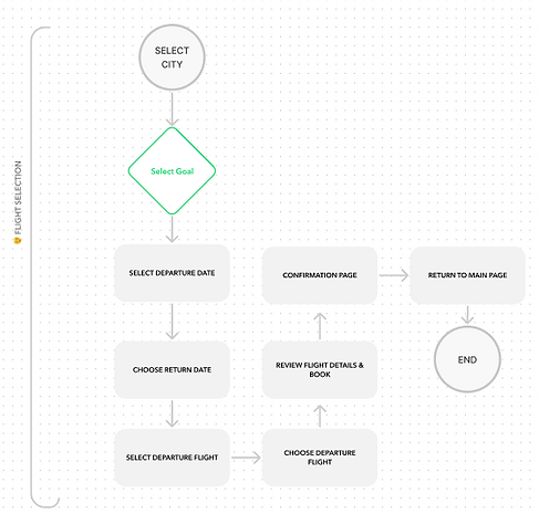
User Flow
I decided to create the task flow below to help clarify the process and to keep focused on the specific issue I was looking to solve. The flow below displays the flight booking task flow.
Wireframes
Wireframes in Figma came after the creation of the user flow. I decided to wireframe in Figma because of the ease of use and the prototyping ability in the platform. These are the first and second sets of frames before creating a prototype and user testing.

1st Version of Frames

Iterated Version of Frames

Iterated 3rd Version of Frames
Prototype
After creating the low-medium wireframes, I moved forward with creating my prototype also using Figma. I kept the transitions and screens basic to focus on the user flow and test the experience before moving to higher fidelity.
User Testing
I selected five users for initial testing. My users were timed to determine how quickly they could book a flight using Google and the Airbnb app separately. After completing these two tasks, they were timed as they booked a flight and Airbnb stay using the prototype created in Figma.
Results:
Average time to book (Google) - 60.5 seconds
Average time to book (Airbnb) - 34.75 seconds
Average time to book (Prototype) - 26 seconds
Time savings of 68.8 seconds
Hindsight & Lessons
I was pleased my prototype performed well, taking only 26 seconds to navigate through the conceptual app, compared to 94.8 seconds on average to complete both tasks. My goal for the redesign was to make the experience faster and easier for users. These improvements could result in higher conversion rates and less cognitive load for the users in the real world.